
Visual Identity System — Alcides Biagetti School of Art
Project Overview
Developed in 2019 in response to the communication challenges intensified by the pandemic, this project aimed to adapt the school’s institutional identity to a digital educational context.
The Alcides Biagetti School of Art, serving over 1,000 students across the region, required a structured visual system capable of supporting clearer communication through online platforms while maintaining its cultural legacy.
The objective was to create a coherent identity framework that respected the institution’s history while enabling accessibility, consistency, and adaptability across digital and physical environments.


The project began with a research phase that included interviews with teachers, approximately 25 student interviews, and an open survey to gather perspectives on the school’s identity. The investigation also examined the local cultural context, the legacy of the artist after whom the institution is named, and the architectural possibilities of the new facilities.
Based on these insights, the design direction was defined with a structured approach, ensuring that each visual decision was grounded in research. The objective was to preserve the institution’s cultural identity while enabling its transition into a more digitally accessible communication system.
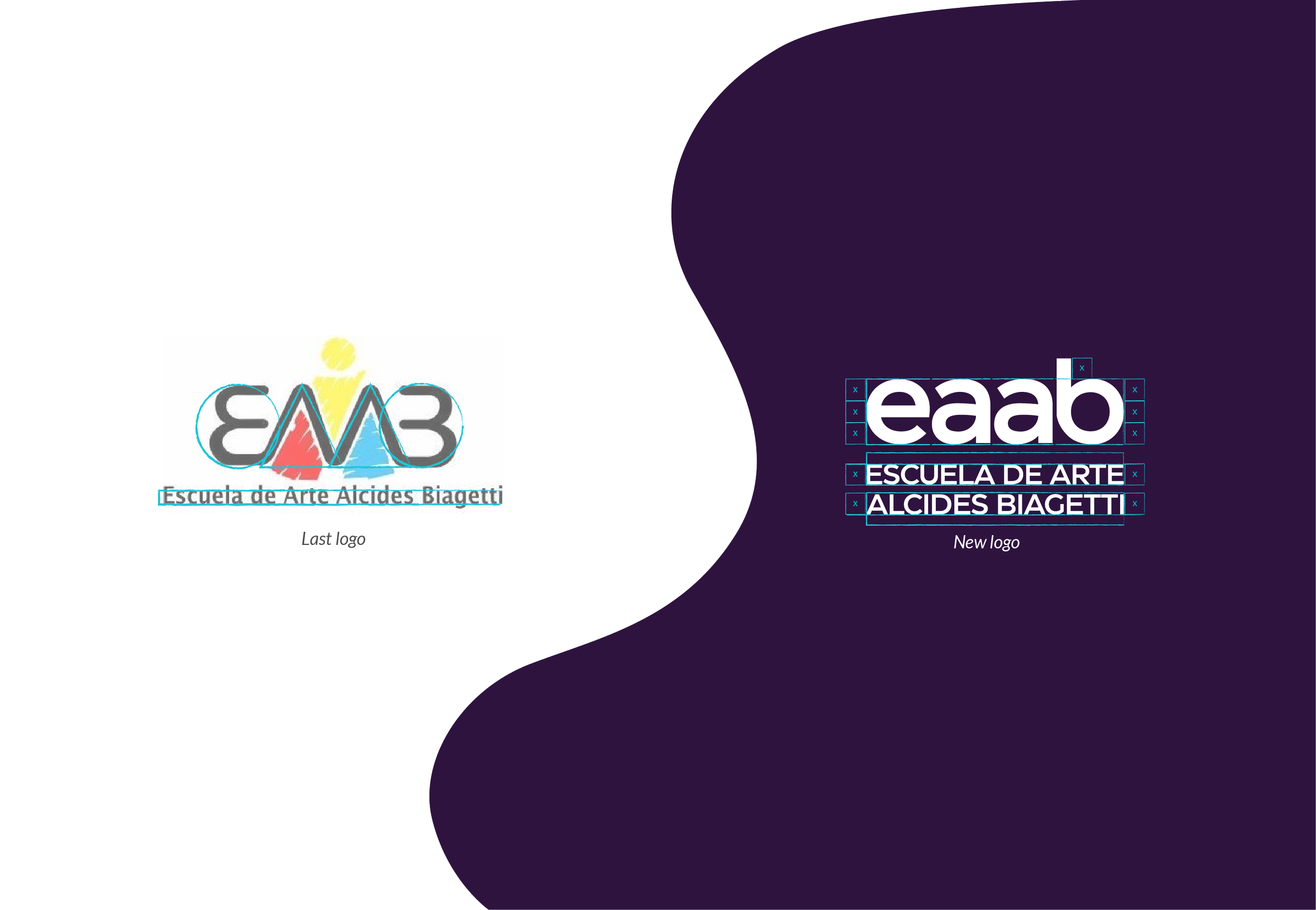


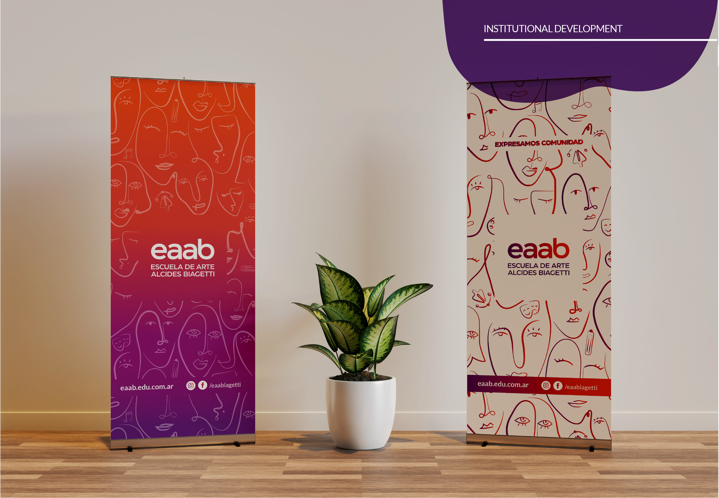
The color palette was inspired by the community itself. A vibrant violet was chosen to represent the school as a whole, supported by gradients to enhance the visual system’s flexibility. Additional colors: orange, yellow, green, and another shade of violet, were carefully selected to represent the school’s artistic branches: Music, Theater, Visual Arts, and Graphic Design,
This color selection was directly informed by the surveys and interviews conducted with students and staff, ensuring the system reflects how the community perceives and experiences each artistic area. These colors became essential in structuring the institution’s visual identity and are used across visual applications and internal signage, supporting both clarity and a sense of belonging within the school.

Implementing the Visual Identity Across Digital Platforms


Interior and Outdoor Signage


Audiovisual Material
Spot Institucional
Expressing Community is at the Heart of Our Identity
The Escuela de Arte Alcides Biagetti is shaped by its students, their roots, stories, interventions, traditions, and the community they build together. These values define who we are, reminding us that even as we adapt to new technologies and the digital era, we remain committed to preserving what makes us unique.
We express community. We express art.
Spot WEB - EAABIAGETTI
As part of the proposal to adapt communication to a new digital era and improve accessibility for students, the project included creating a website to represent the renewed image of the Escuela de Arte Alcides Biagetti. This new website would bring students daily updates, programs, upcoming events, project news, enrollment information, and more, helping them stay connected and informed.
Website Architecture


Website Architecture & Flow Overview
The website architecture was designed to support the school’s transition into a more accessible digital communication system while preserving its institutional identity. The structure prioritised clarity, hierarchy, and intuitive navigation for students, families, and staff.
The homepage functions as a central entry point, guiding users toward four primary sections:
Institutional: History, governance, and official information to strengthen transparency and community connection.
Academic Offer: Structured presentation of programs in Music, Theater, Visual Arts, and Graphic Design, including syllabi and enrollment details.
Gallery: A curated digital space showcasing student work and institutional activities.
Contact: Location, communication channels, and social media integration to facilitate direct interaction.
This structured flow ensures that key information is easily accessible while maintaining consistency across digital touchpoints.

Conclusion
This redesign was grounded in research, examining the school’s history, identity, and cultural context to ensure continuity while enabling digital adaptation. The project reinforced my understanding of how visual identity functions as part of a broader communication system within educational institutions.
It strengthened my ability to translate community values into structured visual and digital frameworks, supporting clearer access to information during a period of institutional transition.
This experience marked an early step in understanding how design can support organisational adaptation, particularly when education systems are required to evolve rapidly in response to external challenges.